Introduction
As developers, we know that projects are constantly evolving: needs change, designs transform, and initial specifications can quickly become obsolete.
Faced with this ever-changing environment, our traditional components sometimes show their limitations. They are not all adapted to handle this constant evolution in a flexible and robust manner.
Who hasn’t been frustrated by a component too rigid to accommodate a design change or an update to project requirements?
Let’s examine together two examples to illustrate the Design Pattern: Compound Components.
Example of a Simple UI Component
Suppose we need to create a classic Card component. We need to display a title, a description, and a thumbnail.
Here’s a simple implementation of what this component could look like:
// card.tsx

type CardProps = {
  title: string;
  description: string;
  thumbnail: string;
}

function Card({ title, description, thumbnail }: CardProps) {
  return (
    <View>
      <Image source={{ uri: thumbnail }} />
      <Text>{title}</Text>
      <Text>{description}</Text>
    </View>
  )
}
And its usage:
// home.tsx

function HomeScreen() {
  return (
    <View>
      <Card
        title="Lorem ipsum"
        description="Quis enim aliqua ad et consectetur laboris reprehenderit ea anim occaecat adipisicing duis exercitation magna cupidatat."
        thumbnail="https://picsum.photos/200/300"
      />
    </View>
  )
}
So far, so good. Our component is simple to develop, simple to use, and easy to read.
Now, as in all projects, the need evolves and the design of our components with it. Let’s say our need has evolved so that we need to add a button to our Card component. But this button should not appear in all places of my application.
What we’ll find in most professional projects today is an overload of properties on the component. Most often, our component would be as follows:
// card.tsx

type CardProps = {
  title: string;
  description: string;
  thumbnail: string;
  buttonLabel?: string;
  showButton?: boolean;
  onPressButton?: () => void;
}

function Card({
  title,
  description,
  thumbnail,
  buttonLabel,
  showButton = false,
  onPressButton
}: CardProps) {
  return (
    <View>
      <Image source={{ uri: thumbnail }} />
      <Text>{title}</Text>
      <Text>{description}</Text>
      {showButton && <Button label={buttonLabel} onPress={onPressButton} />}
    </View>
  )
}
NB: This is deliberately exaggerated to highlight the problem. Even without Compound Components, which we’ll see later, we can have a much cleaner component!
And the usage of the component would be as follows:
// home.tsx

function HomeScreen() {
  return (
    <View>
      <Card
        title="Lorem ipsum"
        description="Quis enim aliqua ad et consectetur laboris reprehenderit ea anim occaecat adipisicing duis exercitation magna cupidatat."
        thumbnail="https://picsum.photos/200/300"
      />
      <Card
        title="Lorem ipsum"
        description="Quis enim aliqua ad et consectetur laboris reprehenderit ea anim occaecat adipisicing duis exercitation magna cupidatat."
        thumbnail="https://picsum.photos/200/300"
        buttonLabel="Lorem"
        onPressButton={() => { /* ... */}}
        showButton
      />
    </View>
  )
}
Observations
What can you observe about this example of a “traditional” component that only represents UI?
- Rigid structure — The Card component has a defined structure, it always contains an image, a title, a description, and a button. There’s no flexibility to change the structure of a component based on needs.
- Prop passing — All the data that the Card component needs is passed via props. This can become cumbersome and difficult to maintain as we add more props to the component.
- Less reusability — The sub-components cannot be reused independently. For example, if we want to use only the button or the image of the card in another component, this would not be possible.
- Not easily extensible — Adding new features to the card requires modifying the card implementation itself, potentially increasing the risk of creating unrelated bugs.
- Simplicity — However, in some cases, this approach may be preferable for its simplicity. If your component is very simple and doesn’t need the advantages offered by the Compound Components pattern, the overhead in complexity may not be worth it.
Example of a More Complex Component
Now let’s assume we need to create a more complex component, or rather a set of components, that work together to implement a Todo-list functionality. For this, we’ll have the components TodoList (to display a list of todo items), TodoItem (which represents a todo item), TodoForm (which represents the form for a todo item) and TodoStats (which displays statistics for a given todo list).
Here’s an implementation of what these components might look like:
// todo-list.tsx

type TodoListProps = {
  todos: Array<{ id: string; content: string }>;
  onPressDelete: (id: string) => void;
}

function TodoList({ todos, onPressDelete }: TodoListProps) {
  return (
    <View>
      {todos.map((todo) => (
        <TodoItem
          key={todo.id}
          id={todo.id}
          content={todo.content}
          onPressDelete={onPressDelete}
        />
      ))}
    </View>
  )
}

// todo-item.tsx

type TodoItemProps = {
  id: string;
  content: string;
  onPressDelete: (id: string) => void;
}

function TodoItem({ id, content, onPressDelete }: TodoItemProps) {
  return (
    <View>
      <Text>{content}</Text>
      <Button label="Delete" onPress={() => onPressDelete(id)} />
    </View>
  )
}

// todo-form.tsx

type TodoFormProps = {
  onPressSubmit: (content: string) => void;
}

function TodoForm({ onPressSubmit }: TodoFormProps) {
  const [value, setValue] = useState<string>('')

  return (
    <View>
      <TextInput value={value} onChangeText={setValue} />
      <Button label="Add" onPress={() => onPressSubmit(value)} />
    </View>
  )
}

// todo-stats.tsx

type TodoStatsProps = {
  todos: Array<{ id: string; content: string }>;
}

function TodoStats({ todos }: TodoStatsProps) {
  return (
    <View>
      <Text>Sum of todos: {todos.length}</Text>
    </View>
  )
}
And here’s how these components would be used:
// home.tsx

function HomeScreen() {
  const [todos, setTodos] = useState([])

  return (
    <View>
      <TodoList
        todos={todos}
        onPressDelete={(id) =>
          setTodos((state) => state.filter((todo) => todo.id !== id))
        }
      />
      <TodoStats todos={todos} />
      <TodoForm
        onPressSubmit={(content) =>
          setTodos((state) => [...state, { id: uuid(), content }])
        }
      />
    </View>
  )
}
Observations
What can you observe about this example of a “traditional” component that now represents a more complex functionality?
- Rigidity — In its current state, the structure is quite rigid. For example, if you want another variant of
TodoItemthat has a button to mark a task as completed, or perhaps a variant ofTodoFormthat has additional fields, adapting these components to these scenarios would be more complex. - Prop passing — The delete and add functions are passed as props to the child components
TodoItemandTodoFormfrom the parent componentHomeScreen. This can become complicated to manage as the application grows, because every time you want to use these functions, you have to pass them through all intermediate components. - Lack of encapsulation — The
TodoItemandTodoFormcomponents expose too many implementation details. For example,TodoItemneeds to know not only the content of the task, but also its id and how to handle a delete action. This could be avoided with a composed version that would hide these details. - Limited extensibility and readability — I think this point is self-explanatory enough!
The Design Pattern: Compound Components
The Design Pattern: Compound Components applies to any language that works with components and state management. It’s an approach that offers:
- Structure — The term “Compound Components” describes a “has-a” relationship between components. A component consists of multiple sub-components that work together to form a cohesive unit. The parent component serves as a layout component while the sub-components determine the content.
- Flexibility — Compound Components offer great flexibility in arranging sub-components. Users of this component API can control the organization, structure, and presentation of a component.
- Abstraction — They allow for a good separation of concerns as each sub-component deals with a particular functionality. This allows for better reuse of components and simplifies testing and maintenance.
- No prop passing — A major advantage of the Compound Components pattern is the avoidance of prop-drilling, which is a problem where props need to be passed through many levels of components. Compound Components solve this problem by using React context to share the value between components.
- Encapsulation — With Compound Components, we can expose what is necessary and hide specific implementation details. This helps produce clearer and easier to maintain code.
Practical Implementation
Now, let’s refactor our previous components into Compound Components.
The Simple UI Component as Compound Components
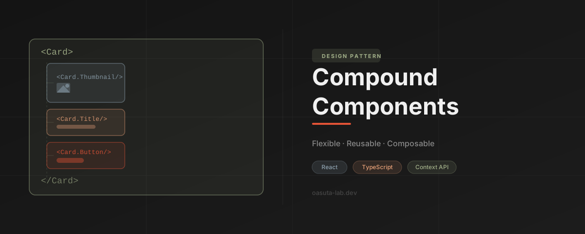
Let’s take our simple UI component and convert the props title, description, etc. into sub-components to create a composition as follows:
// card.tsx

type CardProps = PropsWithChildren

function Card({ children }: CardProps) {
  return <View>{children}</View>
}

Card.Title = CardTitle
Card.Description = CardDescription
Card.Thumbnail = CardThumbnail
Card.Button = CardButton

// card-title.tsx

type CardTitleProps = { title: string }

function CardTitle({ title }: CardTitleProps) {
  return <Text>{title}</Text>
}

// card-description.tsx

type CardDescriptionProps = { description: string }

function CardDescription({ description }: CardDescriptionProps) {
  return <Text>{description}</Text>
}

// card-thumbnail.tsx

type CardThumbnailProps = { source: string }

function CardThumbnail({ source }: CardThumbnailProps) {
  return <Image source={{ uri: source }} />
}

// card-button.tsx

type CardButtonProps = {
  label: string;
  onPress: () => void;
}

function CardButton({ label, onPress }: CardButtonProps) {
  return <Button label={label} onPress={onPress} />
}
And now the usage:
// home.tsx

function HomeScreen() {
  return (
    <View>
      <Card>
        <Card.Thumbnail source="https://picsum.photos/200/300" />
        <Card.Title title="Lorem ipsum" />
        <Card.Description
          description="Quis enim aliqua ad et consectetur laboris reprehenderit ea anim occaecat adipisicing duis exercitation magna cupidatat."
        />
      </Card>
      <Card>
        <Card.Thumbnail source="https://picsum.photos/200/300" />
        <Card.Title title="Lorem ipsum" />
        <Card.Description
          description="Quis enim aliqua ad et consectetur laboris reprehenderit ea anim occaecat adipisicing duis exercitation magna cupidatat."
        />
        <Card.Button label="Lorem" onPress={() => { /* ... */}} />
      </Card>
    </View>
  )
}
Observations
What observations can you make this time?
- Flexibility — Compound Components provide greater control over the organization of elements in the rendering. In the second usage example, we have additional information and the absence of a button, which wouldn’t be possible with a non-composed version of the component that strictly limits the structure.
- Reusability — Sub-components, such as
CardTitle,CardImage, andCardContentcan be freely reused and rearranged. This approach reduces code duplication and increases maintainability. - Readability — The code is easier to understand. While a non-composed component might have a large number of props, which could make the code harder to follow, each sub-component clearly knows its role in the card component.
- Isolation — Sub-components (like
CardButtonorCardImage) can be updated independently of other sub-components, thus avoiding unexpected side effects. - Scalability — New sub-components can be easily added following this approach, allowing the component to adapt and evolve over time. For example, a
CardFootersub-component could be added if needed.
The Complex Component as Compound Components
Finally, let’s move on to the most interesting part, the group of components that represents the Todo-list functionality. Here’s the Compound Components version:
// todos.tsx

type TodosProps = PropsWithChildren<{
  data: Array<{ id: string; content: string }>;
}>

function Todos({ data, children }: TodosProps) {
  const [todos, setTodos] = useState(data)

  const contextValue = useMemo(() => ({
    todos,
    add: (content: string) => setTodos((state) => [...state, { id: uuid(), content }]),
    remove: (id: string) => setTodos((state) => state.filter((todo) => todo.id !== id))
  }), [todos])

  return (
    <TodosContext.Provider value={contextValue}>
      {children}
    </TodosContext.Provider>
  )
}

Todos.List = TodosList
Todos.Form = TodosForm
Todos.Stats = TodosStats

// use-todos-context.tsx

type TodosContextValue = {
  todos: Array<{ id: string; content: string }>;
  add: (content: string) => void;
  remove: (id: string) => void;
}

const TodosContext = createContext<TodosContextValue>({} as TodosContextValue)

const useTodosContext = () => {
  const context = useContext(TodosContext)
  if (!context) {
    throw new Error('useTodosContext should be used within <Todos>')
  }
  return context
}

// todos-list.tsx

function TodosList() {
  const { todos } = useTodosContext()

  return (
    <View>
      {todos.map((todo) => (
        <TodosListItem key={todo.id} id={todo.id} content={todo.content} />
      ))}
    </View>
  )
}

TodosList.Item = TodosListItem

// todos-list-item.tsx

type TodosListItemProps = { id: string; content: string }

function TodosListItem({ id, content }: TodosListItemProps) {
  const { remove } = useTodosContext()

  return (
    <View>
      <Text>{content}</Text>
      <Button label="Delete" onPress={() => remove(id)} />
    </View>
  )
}

// todos-form.tsx

function TodosForm() {
  const { add } = useTodosContext()
  const [value, setValue] = useState<string>('')

  return (
    <View>
      <TextInput value={value} onChangeText={setValue} />
      <Button label="Add" onPress={() => add(value)} />
    </View>
  )
}

// todos-stats.tsx

function TodosStats() {
  const { todos } = useTodosContext()

  return (
    <View>
      <Text>Sum of todos: {todos.length}</Text>
    </View>
  )
}
And here’s its usage, drastically simplified:
// home.tsx

function HomeScreen() {
  return (
    <View>
      <Todos data={[]}>
        <Todos.List />
        <Todos.Stats />
        <Todos.Form />
      </Todos>
    </View>
  )
}
Observations
What can we observe about this last part?
- Display Flexibility — With the Compound Components approach, the layout of components is much more flexible. You can choose to render
Todos.List,Todos.Form, andTodos.Statsin any order or even not display them depending on the specifics of your application’s requirements or needs. - Use of Context — Thanks to the use of React Context (
TodosContext), you can easily share data (todos) and functions (add,remove) among all child components. This avoids the prop-drilling problem inherent to the non-compound components approach. - Custom Hook — They use a custom hook
useTodosContextto obtain the context values. This hook makes the code more readable and easier to use. - Increased Reusability — The components are now more independent and can be easily reused elsewhere in the application. For example,
Todos.Listcan be used in another screen or in a sidebar without needing to pass additional information via props. - Extensibility — With this approach, you can also easily extend the
Todoscomponent by adding additional sub-components without disrupting the existing architecture. For example, if you want to add functionality to mark tasks as done, you could create a new sub-componentTodos.Checkbox.
Conclusion
In general, the “traditional” component is simpler, but it offers less flexibility and potential for reuse than Compound Components. The choice between the two approaches depends on the specific needs of the project. But from my experience, starting directly with Compound Components is rarely a bad idea!
The potential drawbacks of this approach are that it is more complex and requires a deeper understanding of React concepts (in the case of React), such as Context and Compound Components themselves. Additionally, it’s important to note that while Context may seem like a solution to all problems, it should be used sparingly to avoid excessive coupling between components in your application.
Adopting the Compound Components pattern in user interface design may seem confusing at first, but the benefits it offers in terms of modularity, flexibility, and reusability are undeniable. Thus, by intelligently breaking down components into logical sub-elements, we can produce flexible, reusable, and manageable UI systems.
You can also find this article in video format on YouTube by following this link.